Canadian Tire: Off-Boarding
Company:
Canadian Tire Loyalty App - Retail Industry
Year:
2020 - 2021
Role:
Senior Product Designer
Canadian Tire Corporation (CTC) is an iconic Canadian brand known for its wide range of retail brands and services. The company’s Canadian Tire Money is one of Canada’s most beloved loyalty programs.
about.
To appeal to a younger, more digitally-minded demographic, Canadian Tire Corporation (CTC) launched Triangle Rewards in 2018. This program allows members to collect and redeem Canadian Tire Money online and in-store at Canadian Tire and various other retailers. With a Triangle account, users can collect digital Canadian Tire Money using their Triangle Rewards card, keychain mini-card, or mobile app.
The Triangle ecosystem spans multiple brands including Canadian Tire Retail, Mark’s, SportChek, Gas+, and Triangle banking services, all connected through a shared Triangle ID account system.
On the Triangle team, I worked as the Product Designer, focusing exclusively on the Triangle Rewards mobile app and related banking app experiences.
other projects.
design principles.
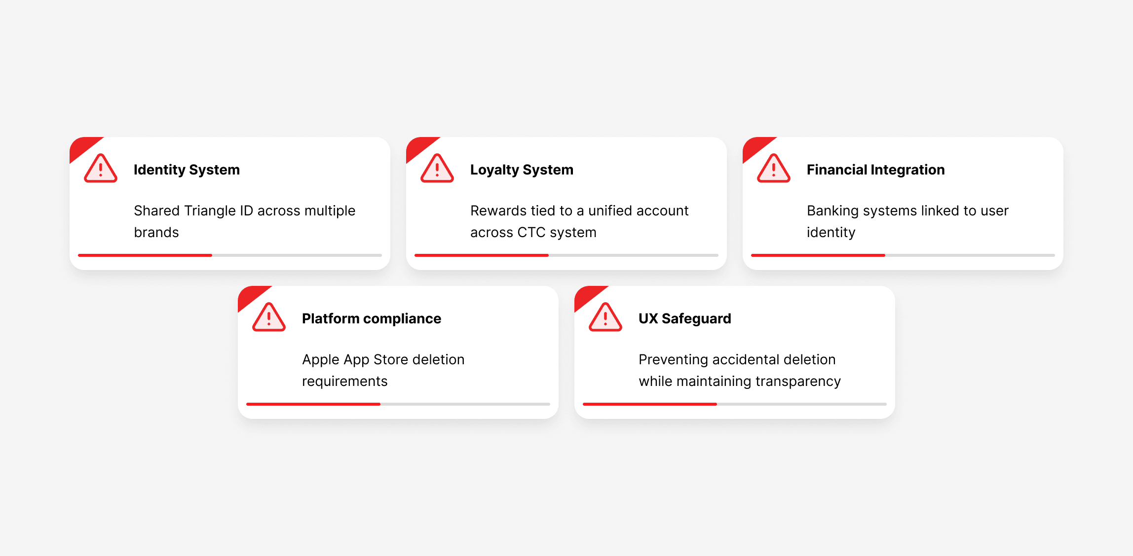
To guide the design of the deletion experience, I defined a set of heurestics principles based on research insights and product constraints.
Visibility of System Status
Users must clearly understand what happens when they delete their account and need reassurance about the impact on rewards, transactions, and account data.
Error Prevention
The flow should prevent accidental deletion through progressive confirmation.
User Control and Freedom
Users should be able to exit the process at any point before final confirmation.
user flow.
The deletion flow was designed as a step-by-step experience to guide users through verification, education about account impacts, and final confirmation.
This approach reduces confusion and prevents accidental deletion while meeting Apple’s compliance requirements.

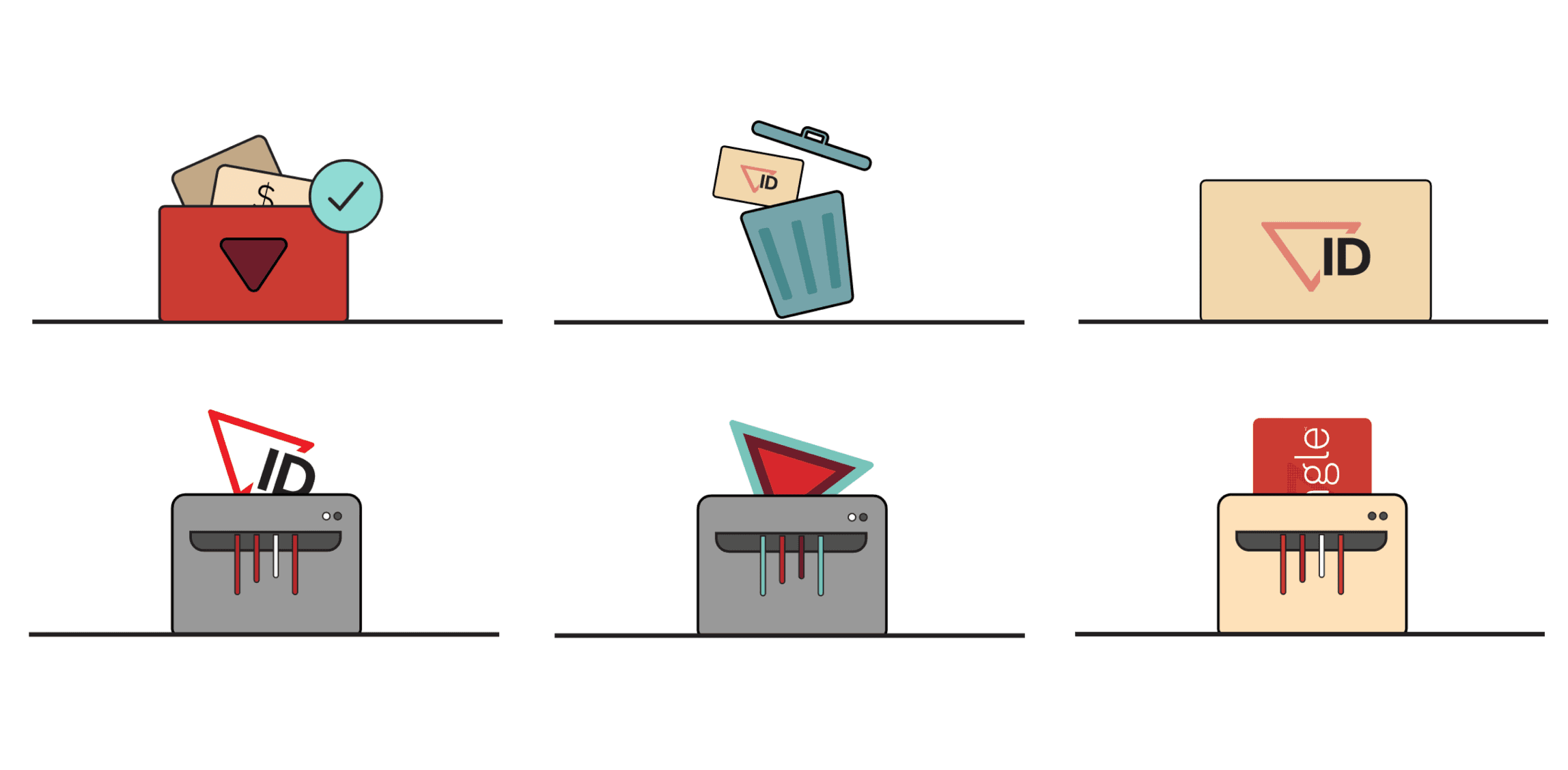
Expanding the design system.
The existing Triangle design system did not include illustrations for critical system actions such as account deletion.
To support this feature while maintaining visual consistency, I designed a new set of illustrations inspired by the existing Triangle visual language and iconography.
These illustrations helped communicate complex actions such as deleting an account in a more approachable and supportive way.
Through guerrilla testing and internal reviews, we evaluated which concepts best communicated the action while minimizing anxiety around account deletion.
The selected illustrations were incorporated into the final deletion flow and later added to the official Triangle design library, enabling reuse across future product experiences.
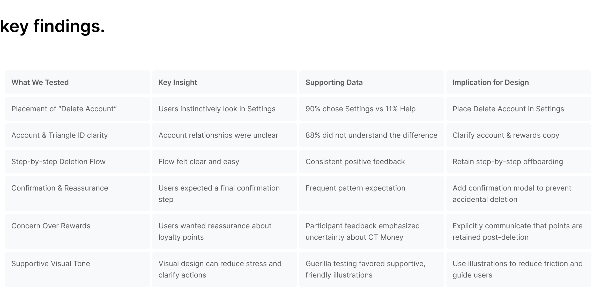
research.
Pattern Review: Conducted a teardown of major apps to identify best practices for account deletion and optimal UI placements.
Information Architecture Testing: Ran a digital card-sorting exercise to understand where users expected to find account deletion.
Usability Testing: Conducted moderated sessions with 9 participants to evaluate expectations, comprehension, and emotional comfort during the offboarding process.

iteration.
Redesigned information architecture to place account deletion under Settings.
Created step-by-step user flows including verification, confirmation dialogs, and clear messaging about data removal.
Led content strategy updates and UX writing guidance to clarify Triangle ID, account linking, and post-deletion impacts.
Integrated illustrations selected through guerrilla testing to make the process visually intuitive.
Ensured accessibility standards were met across mobile and desktop platforms.
final designs.
I designed the account deletion flow using the Canadian Tire visual style to maintain consistency across the app. Leveraging the existing design system, I enhanced usability and accessibility, resulting in a smooth, intuitive experience that aligns with the app’s friendly, approachable vibe.
Final deletion flow designed for the Canadian Tire ID, establishing a consistent offboarding pattern across all partner products within the within the CTC ecosystem.

Final high-fidelity mockups of the account deletion experience.
lessons learned.
Including clear explanations for each step ensured that users understood the entire process and reduced confusion. Designing the account deletion flow reinforced for me the importance of clear communication at every stage. Even a seemingly simple task like deleting an account requires thoughtful design to make users feel informed and respected throughout. I also came to appreciate the balance between security, simplicity, and guiding users without overwhelming them. This process truly highlighted how essential it is to continually examine workflows and look for ways to improve them.