Canadian Tire: Filters
Company:
Canadian Tire Loyalty App - Retail Industry
Year:
2020 - 2021
Role:
Senior Product Designer
Canadian Tire Corporation (CTC) is an iconic Canadian brand known for its wide range of retail brands and services. The company’s Canadian Tire Money is one of Canada’s most beloved loyalty programs.
about.
To modernize the experience and attract a younger, digitally minded audience, the company launched Triangle Rewards in 2018, an earn-and-burn program that lets members collect and redeem Canadian Tire Money seamlessly across Canadian Tire and partner stores, both online and in-store.
Earn & Burn programs are one of the most traditional methods of running a loyalty program, where customers earn points for money spent, with the main aim of encouraging repeat purchases to reach new rewards. Today, customers expect more than just points-based or dollar-per-dollar rewards—they want brands to make them feel special and offer exclusive experiences and benefits.
Triangle Rewards is a loyalty platform used by millions of Canadian Tire customers to browse, activate, and redeem offers across partner brands.
While the platform successfully enabled customers to earn and redeem Canadian Tire Money, the Offers experience had become visually dense and difficult to scan.
As a result, users struggled to quickly identify the most relevant promotions and differentiate between Personalized Offers and Weekly Flyers.
other projects.
challenge.
Users were struggling to understand the difference between Personalized Offers and Weekly Users struggled to understand the difference between Personalized Offers and Weekly Flyer Deals, leading to confusion around activation, filtering, and redemption.
The design challenge was to:
Reduce cognitive load
Improve clarity between offer types
Enable faster scanning and activation
Ensure filters feel intuitive and quick to use
The Offers page plays a critical role in driving engagement within the loyalty ecosystem. If users cannot easily identify relevant promotions, they are less likely to activate offers or engage with the program.

research.
Pattern analysis: I conducted a pattern analysis of common filtering approaches in loyalty and retail apps. This helped identify best practices, establish a shared design language, and inform decisions on layout, interaction depth, and visual hierarchy. Insights from this analysis guided both layout explorations and filter design decisions in the Triangle Rewards app.
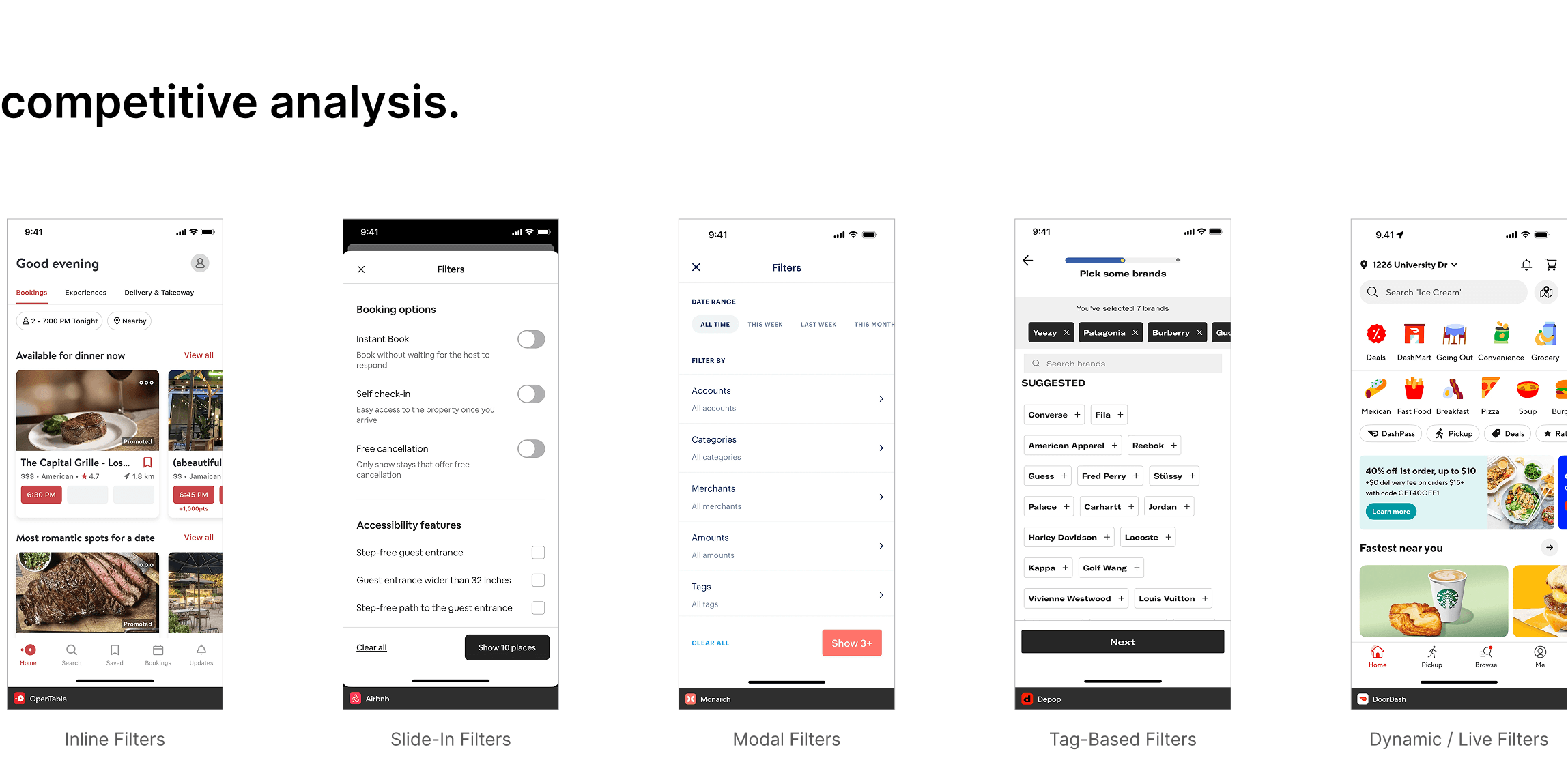
Competitive Analysis: I reviewed how other loyalty apps (Airbnb, Amazon, DoorDash, OpenTable) handled offers and filtering to identify best practices. I explored popular apps and analyzed both their visual layout and the filtering mechanisms to understand how they communicated offer types and improved user engagement.
Data Analysis: Analyzed click patterns in the mobile app and website, incorporating insights from the data team to understand user behavior.
User Interviews & Prototype Testing: We conducted moderated sessions with 9 active Triangle Rewards members per round.
Participants completed tasks such as:
Activating offers
Filtering by category, brand, or multiplier
Differentiating Personalized Offers from Weekly Flyer Deals using different layouts and UI treatments to test clarity and usability
Before the sessions, I prepared survey questions aligned with research objectives to collaborate closely with the user research team. The goal was to uncover user expectations, pain points, and mental models when interacting with offers.

exploration 1.
Participants were given a scenario focused on using the filter step-by-step where they were asked to: select Brand (Canadian Tire) → Category → Offer Type (Multiplier) → Sort Offer Type.
This exploration had identical visual treatment for Weekly Flyers and Personalized Offers and helped us understand how users navigated the existing layout, how quickly they recognized filter options, and whether the baseline structure supported real-world decision making.
exploration 2.
In the second exploration, “Activate” was changed to “Shop Now” for flyer-related offers, and Weekly Flyers were placed in a dedicated section at the bottom. This shift improved comprehension: 78% of participants prioritized Personalized Offers, and Weekly Flyers became easier to identify.
exploration 3.
This third iteration placed Weekly Flyers at the top in a smaller horizontal scroll, allowing quick browsing without overpowering Personalized Offers. Filters were reorganized by category, multiplier, and brand, with clearer visual cues. The prototype introduced Activate / Activated states and Shop Now cards for stronger differentiation.
Expired or used offers were removed from view to reduce unnecessary scrolling and cognitive load.
iteration.
Two rounds of moderated testing were conducted with 9 Triangle Rewards members per round.

Final Design
The final solution focused on three improvements:
Clear Separation of Offer Types: Weekly Flyers placed in a horizontal scroll section.
Improved Filter Structure: Filters organized by category, brand, and multiplier.
Clear Activation States: Activated offers clearly labeled and visually distinct.
Results from testing showed:
• 78% of participants prioritized Personalized Offers
• Users activated offers faster
• Filtering success improved significantly

lessons learned.
Small changes in terminology can significantly affect user comprehension. Separating offer types visually improves scanning speed. Filters must align with user mental models rather than internal business structures.