
Call it Spring FW13
Company:
Aldo Shoes - Call it Spring
Year:
2013
Timeline:
1.5 months
Role:
UX/UI Interaction Designer
Call it Spring (Aldo Shoes Group) has always thrived to stay ahead of the curve with marketing strategies, brand development, and design.
overview.
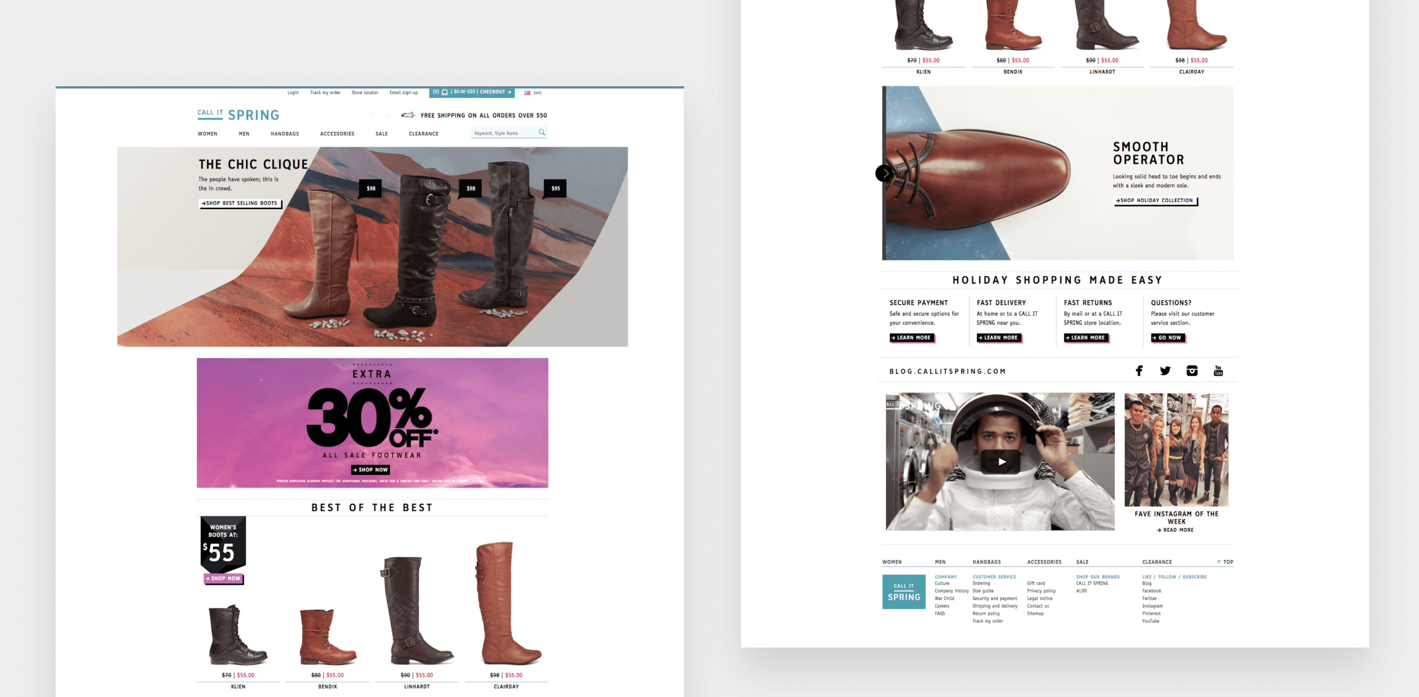
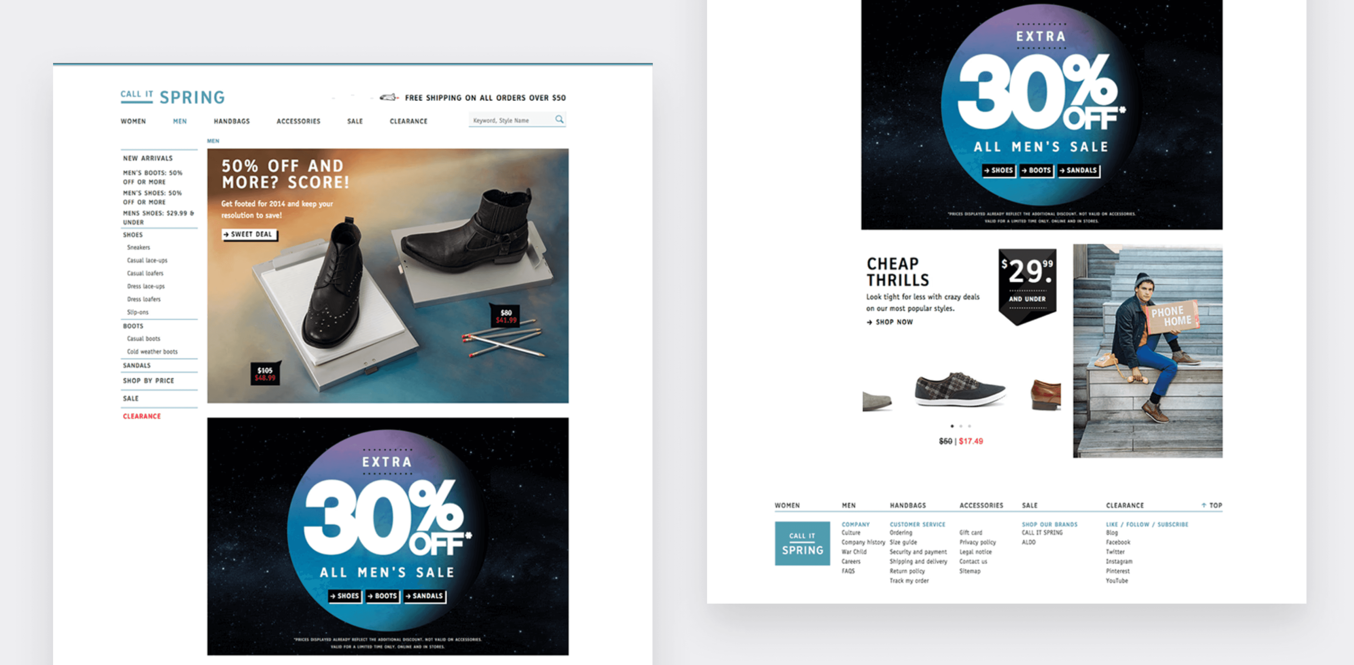
The Fall/Winter 2013 campaign marked a seasonal brand refresh aimed at aligning the digital experience with the new creative direction
While the core website structure remained intact, the objective was to evolve the visual system and campaign presentation layer to better support seasonal storytelling and product marketing.
This project focused on translating brand direction into a cohesive digital expression while ensuring usability and marketing consistency across web and email.
I collaborated closely with marketing, product, and development teams to ensure the design and functionality met user needs while supporting seasonal product campaigns with creative imagery tailored to Fall/Winter storytelling.


target users.
Understanding our target users: young, trend-conscious individuals seeking affordable, stylish footwear, was foundational to the redesign. Our goal was to create an intuitive and visually compelling experience that aligned with the Fall/Winter campaign. By leveraging CMS data, user feedback, and click analytics, we identified key strengths and areas for improvement to better showcase seasonal products, drive engagement, and support sales.
#GenerationSpring


research methods.
Engaged in cross-functional collaboration with marketing, product, development teams, and to understand the preferences and behaviors of our target demographic. we conducted:
Click-based testing
Heat map analysis
User Interviews
Collaboration with marketing and product teams
Insights highlighted opportunities to:
Strengthen visual emphasis on seasonal products
Clarify CTA prominence
Improve promotional hierarchy within fixed templates
concept development.
The FW13 outer-space theme targeted an 18–25-year-old audience and emphasized bold, high-contrast imagery. My contributions included:
Translating campaign direction (space theme) into a cohesive digital visual system across mediums
Directed and coordinated photography ensuring assets aligned with the layout dimensions and design specifications.
Updating copy and visual assets to support seasonal product team.
Updating blog
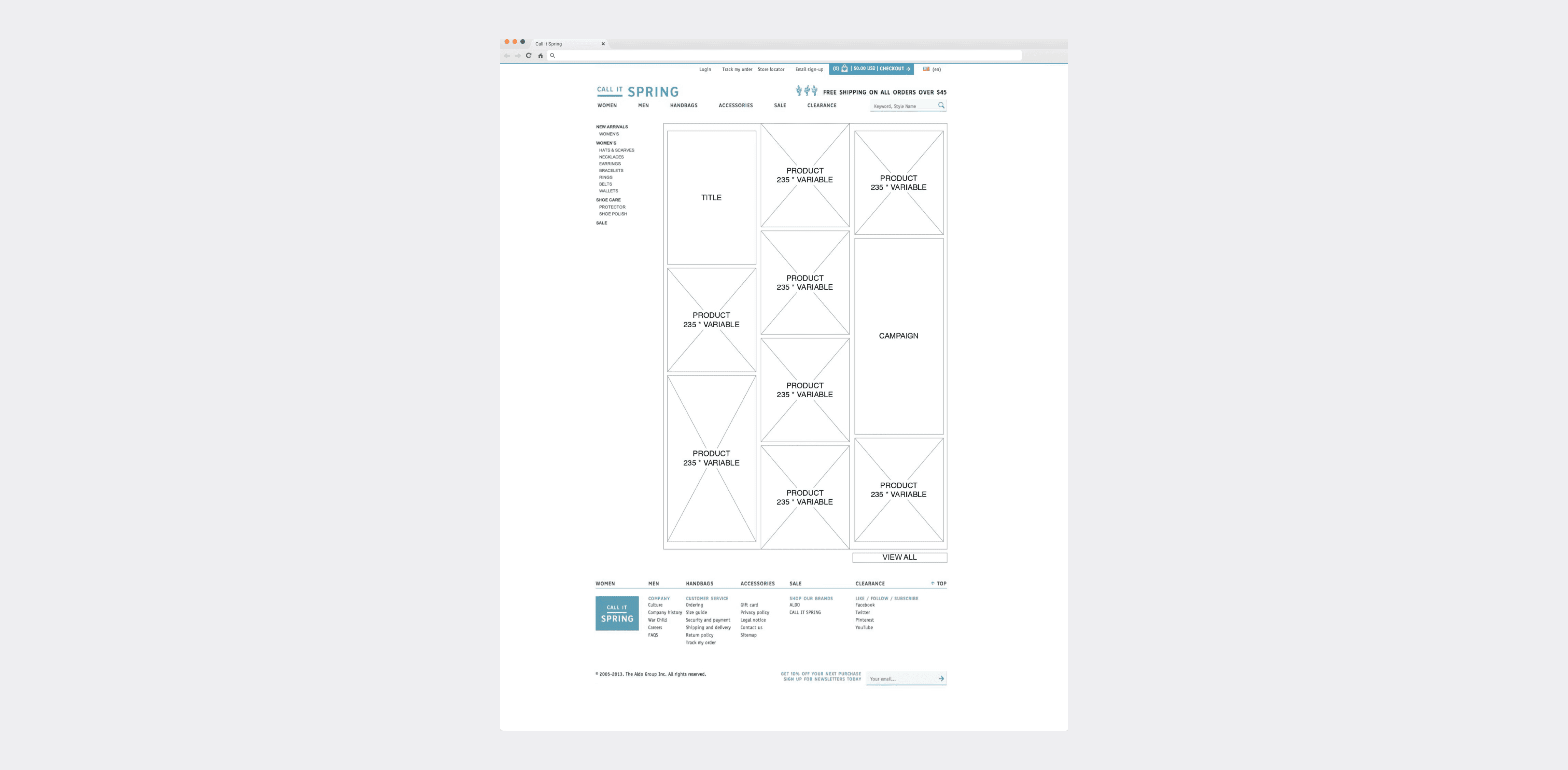
I worked from existing wireframes to familiarize myself with layout dimensions and requirements, which helped guide photography direction and visual design decisions. This also facilitated early alignment across cross-functional teams (product, marketing, engineering, and research), allowing us to assess feasibility and understand how different creative directions could impact timelines and delivery.
While the underlying architecture remained unchanged, the visual refresh improved storytelling clarity and overall campaign cohesion.
cross-channel campaign.
Web, email, and blog campaigns were developed in parallel to maintain consistency across digital touchpoints.
Newsletters adopted a highly visual, image-driven format aligned with the website experience, ensuring strong brand recognition across channels.
Some campaigns incorporated GIF animations to introduce motion within the constraints of email clients.
Email templates were designed with rendering considerations in mind to ensure consistent presentation across devices and email platforms. Compatibility and performance were tested using Litmus.


newsletters.
Newsletters adopted a highly visual, image-driven format aligned with the website experience to ensure recognizability and continuity.
Different technical approaches were used depending on the campaign requirements. Some emails used traditional modular newsletter structures, while others incorporated image maps to create richer interactive areas within the constraints of email clients.
Some campaigns also included GIF animations to introduce motion while remaining compatible with inbox environments.
All templates were designed with rendering considerations in mind and tested across major email clients and devices, ensuring consistent display on mobile and desktop platforms, including iOS and Android.

impact.
The FW13 refresh:
Elevated seasonal storytelling within a fixed structure
Improved campaign cohesion across web and email
Reinforced brand identity during the Fall/Winter launch
Established foundational campaign alignment practices later expanded in SS14
